
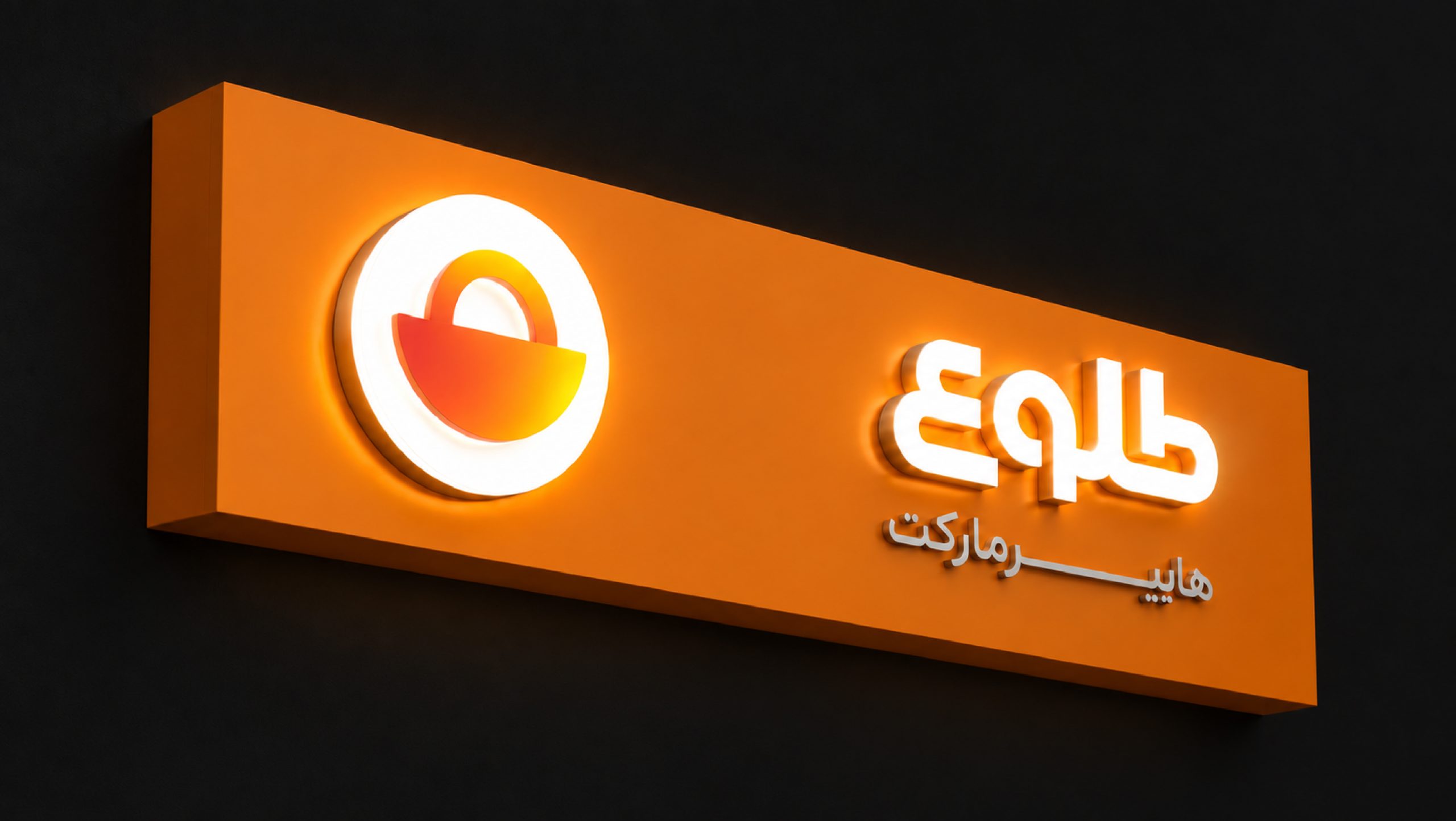
The logo for Tolo Hypermarket needed to tell people right away, even from a distance, that it’s a hypermarket.We wanted Tolo to feel friendly, family-oriented, and fun. And since the name is “Tolo,” which means “sunrise,” we also wanted the logo to have a connection to that idea.So basically, we needed the logo to do two things: make it obvious that it’s a hypermarket, while also somehow connecting to the idea of “Tolo” and sunrise.And honestly, we thought “Tolo” was a really good name for a hypermarket selling everyday FMCG products, so we wanted to make the most of that connection in the logo.


